Opened 12 years ago
Closed 12 years ago
#10835 closed Task (fixed)
Image2: improve visibility of the resizer
| Reported by: | Olek Nowodziński | Owned by: | Olek Nowodziński |
|---|---|---|---|
| Priority: | Normal | Milestone: | CKEditor 4.3 |
| Component: | General | Version: | 4.3 Beta |
| Keywords: | Cc: |
Description
For some people the image resizer might seem invisible. We can try to make it better.
Attachments (1)
Change History (12)
comment:1 Changed 12 years ago by
| Status: | new → confirmed |
|---|
comment:2 Changed 12 years ago by
| Owner: | set to Olek Nowodziński |
|---|---|
| Status: | confirmed → assigned |
comment:3 Changed 12 years ago by
| Status: | assigned → review |
|---|
comment:4 follow-up: 5 Changed 12 years ago by
| Status: | review → review_failed |
|---|
- The outline and resize icon are lost when I leave widget area when resizing. They could be kept just like the mouse cursor is.
- I don't know if we can do anything about that, but the outline is not visible in case of non-captioned image. Therefore, it may not be a good idea to use image outline + widget outline, although it's definitely helpful in case of centered image, especially if it has white background (Stewie's case which I showed you).
- I think that the arrow is too fat :P. I like lighter ones more.
comment:5 Changed 12 years ago by
Replying to Reinmar:
- The outline and resize icon are lost when I leave widget area when resizing. They could be kept just like the mouse cursor is.
Fixed.
- I don't know if we can do anything about that, but the outline is not visible in case of non-captioned image. Therefore, it may not be a good idea to use image outline + widget outline, although it's definitely helpful in case of centered image, especially if it has white background (Stewie's case which I showed you).
IMO this is not a serious case and we can just leave it.
Still, a nice workaround could be if we totally changed .cke_widget_wrapper and .cke_widget_element styles for Image2 (both focus and hover) to mimic dashed bounding boxes just like in Photoshop or so. Then, however, Image2 would stand out and look nothing like other widgets.
- I think that the arrow is too fat :P. I like lighter ones more.
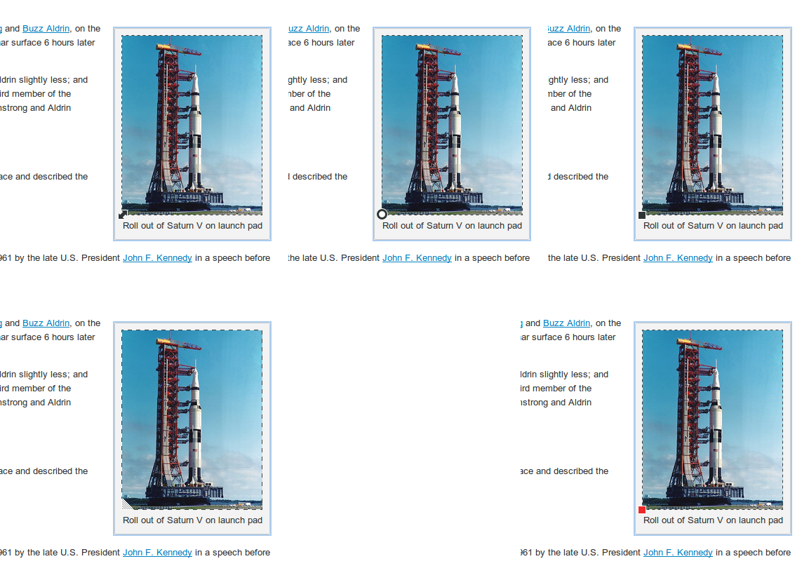
Some ideas, maybe the perfect match for you is among them:
comment:6 Changed 12 years ago by
Some ideas, maybe the perfect match for you is among them:
The dot looks like rotate handler (Maja doesn't like it too), square is good (and we both like it), red square and triangle are bad. I wonder what user not familiar with graphical programs would say though.
IMO this is not a serious case and we can just leave it.
Yes, I could agree with this. Just pointing this out in case someone else has something to say.
Still, a nice workaround could be if we totally changed .cke_widget_wrapper and .cke_widget_element styles for Image2 (both focus and hover) to mimic dashed bounding boxes just like in Photoshop or so. Then, however, Image2 would stand out and look nothing like other widgets.
I'm not sure I fully understand what you mean, but in any case I think that we're fine for now.
comment:7 follow-up: 8 Changed 12 years ago by
I'm good with the black square with white borders.
As for the dots, they're yet another ui element in the already full of flashing things. So, at a first glance I would not go with them.
But then, rethinking, it solves other usability problems. For example, we can have images with background that matches the figure/document background color or even pngs with transparent background. In such cases, without the border, we would see the resize handler floating and it would look weird.
I would go with the easy way first, to not block this ticket. So, no borders and resizer only. Then, opening a new ticket for the border, proposing it so we can understand the issues involved with it.
comment:8 Changed 12 years ago by
| Status: | review_failed → review |
|---|
Replying to fredck:
I'm good with the black square with white borders.
As for the dots, they're yet another ui element in the already full of flashing things. So, at a first glance I would not go with them.
But then, rethinking, it solves other usability problems. For example, we can have images with background that matches the figure/document background color or even pngs with transparent background. In such cases, without the border, we would see the resize handler floating and it would look weird.
I would go with the easy way first, to not block this ticket. So, no borders and resizer only. Then, opening a new ticket for the border, proposing it so we can understand the issues involved with it.
I got rid of that dashed outline and introduced a black square instead of an arrow.
comment:10 Changed 12 years ago by
| Status: | review → review_passed |
|---|
comment:11 Changed 12 years ago by
| Resolution: | → fixed |
|---|---|
| Status: | review_passed → closed |
Merged into major git:ff7a7d9.


I tend to agree. Resizer looks very nice but it seems a little bit too discrete.