Opened 8 years ago
Last modified 8 years ago
#14408 confirmed Bug
Inaccessible "OK" button in dialogs (Moono)
| Reported by: | Olek Nowodziński | Owned by: | |
|---|---|---|---|
| Priority: | Normal | Milestone: | |
| Component: | Accessibility | Version: | 4.0 |
| Keywords: | Cc: |
Description (last modified by )
Problem
The contrast between the white text and green background is too low to meet WCAG 2.0 AA for small text.
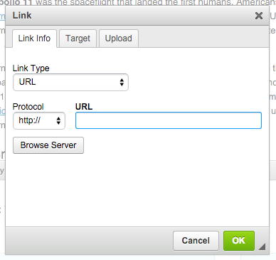
At the moment it looks like

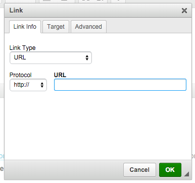
but to meet WCAG 2.0 it must be more like

References
Attachments (2)
Change History (9)
comment:1 Changed 8 years ago by
| Summary: | Inaccessible "OK" button in dialogs → Inaccessible "OK" button in dialogs (Moono) |
|---|
Changed 8 years ago by
| Attachment: | Screen Shot 2016-02-16 at 15.56.35.png added |
|---|
comment:2 Changed 8 years ago by
| Description: | modified (diff) |
|---|
comment:3 Changed 8 years ago by
| Status: | new → confirmed |
|---|
comment:4 follow-up: 5 Changed 8 years ago by
It looks notably worse. I can say that initial gradient was way too bright.
Since mono skin has gradients all over the place, maybe we could apply slightly more notable gradient?
comment:5 Changed 8 years ago by
Replying to m.lewandowski:
It looks notably worse. I can say that initial gradient was way too bright.
Since mono skin has gradients all over the place, maybe we could apply slightly more notable gradient?
Because top color of the button in the 2nd screenshot is the top threshold of AA, you could only make bottom color closer to black and, by doing it, make it even more ominous.
Take a look on http://dasplankton.de/ContrastA/ tool. You can click a button to display WCAG 2.0 thresholds in the color selector. You'll notice that there isn't much room for improvement.
comment:6 Changed 8 years ago by
I like this tool as it provides a bunch of contrasts #55830c on #fff:
It also doesn't require Flash wish is an advantage.
Also, gotta watch with the gradient.
This is a good color contrast tool to check that it works with the css gradients https://chrome.google.com/webstore/detail/color-contrast-analyzer/dagdlcijhfbmgkjokkjicnnfimlebcll?hl=en
comment:7 Changed 8 years ago by
Hmm.. The RGB seems to look fine as does the hex:

But it is still definitely not enough with the CSS gradients.
Current colorset