Opened 15 years ago
Closed 13 years ago
#6795 closed Bug (fixed)
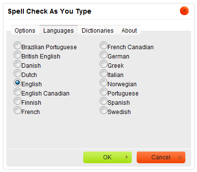
SCAYT Languages tab should contain some spacing between the radio buttons and labels
| Reported by: | Anna Tomanek | Owned by: | Anna Tomanek |
|---|---|---|---|
| Priority: | Normal | Milestone: | |
| Component: | UI : Spell Checker | Version: | |
| Keywords: | HasPatch | Cc: | tech@… |
Description
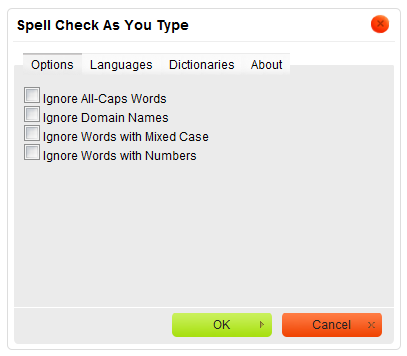
The "Languages" tab of the Spell Check As You Type dialog window would benefit from some spacing between the radio buttons and their labels, similar to the formatting of the "Options" tab & its checkboxes. Right now it looks a bit crammed/ ugly.
Languages tab: http://docs.cksource.com/images/b/b4/CKEditor_SCAYT_languages.png
Options tab: http://docs.cksource.com/images/b/b6/CKEditor_SCAYT_options.png
Attachments (1)
Change History (7)
comment:1 Changed 15 years ago by
| Cc: | tech@… added |
|---|---|
| Component: | UI : Dialogs → UI : Spell Checker |
comment:2 Changed 15 years ago by
| Status: | new → confirmed |
|---|
Changed 15 years ago by
| Attachment: | 6795.patch added |
|---|
comment:3 Changed 15 years ago by
| Keywords: | HasPatch Review? added |
|---|
comment:4 Changed 15 years ago by
| Keywords: | Review? removed |
|---|---|
| Owner: | set to Anna Tomanek |
| Status: | confirmed → review |
comment:5 Changed 15 years ago by
| Status: | review → review_failed |
|---|
This solution does not really work as expected, since it still looks bad for Right-to-Left languages.
Besides, in CKEditor we tend to use a space placed between the checkbox/radio element and the label, like in here: https://dev.ckeditor.com/browser/CKEditor/trunk/_source/plugins/dialogui/plugin.js#L391. This helps save a couple of bytes when compared to adding multiple style declarations.
Would you be able to implement something along these lines instead? Thanks!
comment:6 Changed 13 years ago by
| Resolution: | → fixed |
|---|---|
| Status: | review_failed → closed |
This is no longer a problem in current versions of WSC. Closing as fixed.
Spacing between the radio buttons and labels added.