Opened 15 years ago
Closed 14 years ago
#8629 closed Bug (fixed)
Editor context menu gets unnecessarily clipped
| Reported by: | Lynne Kues | Owned by: | Garry Yao |
|---|---|---|---|
| Priority: | Normal | Milestone: | CKEditor 3.6.3 |
| Component: | UI : Context Menu | Version: | 3.0.2 |
| Keywords: | IBM | Cc: | satya_minnekanti@… |
Description
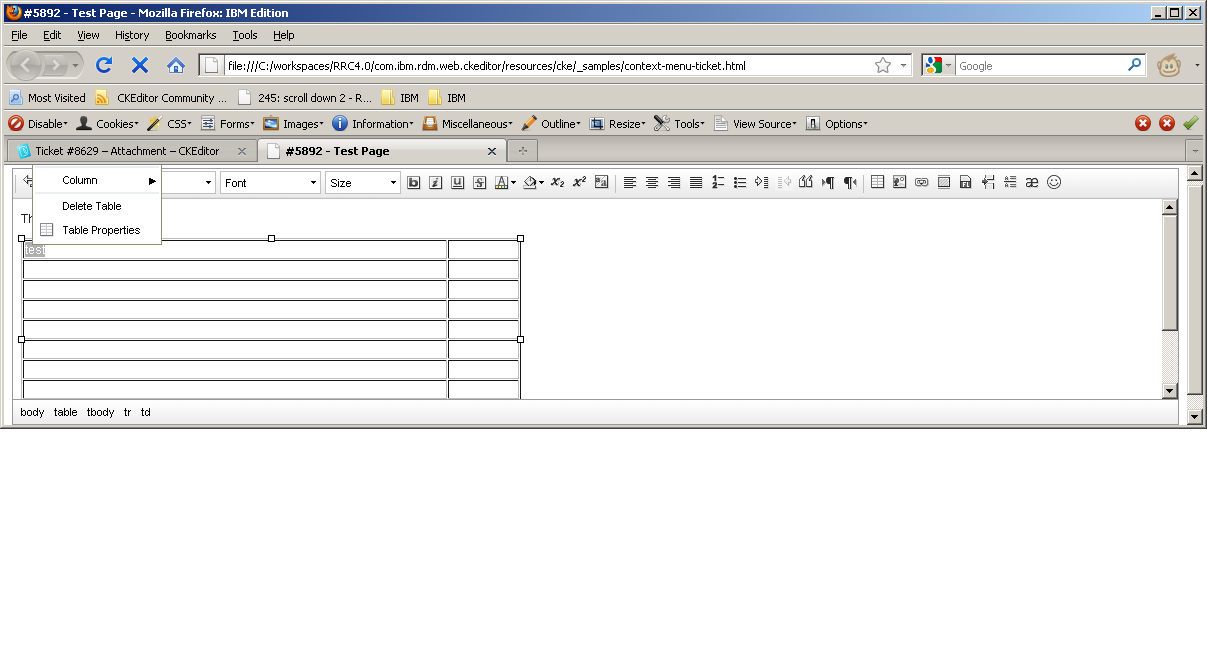
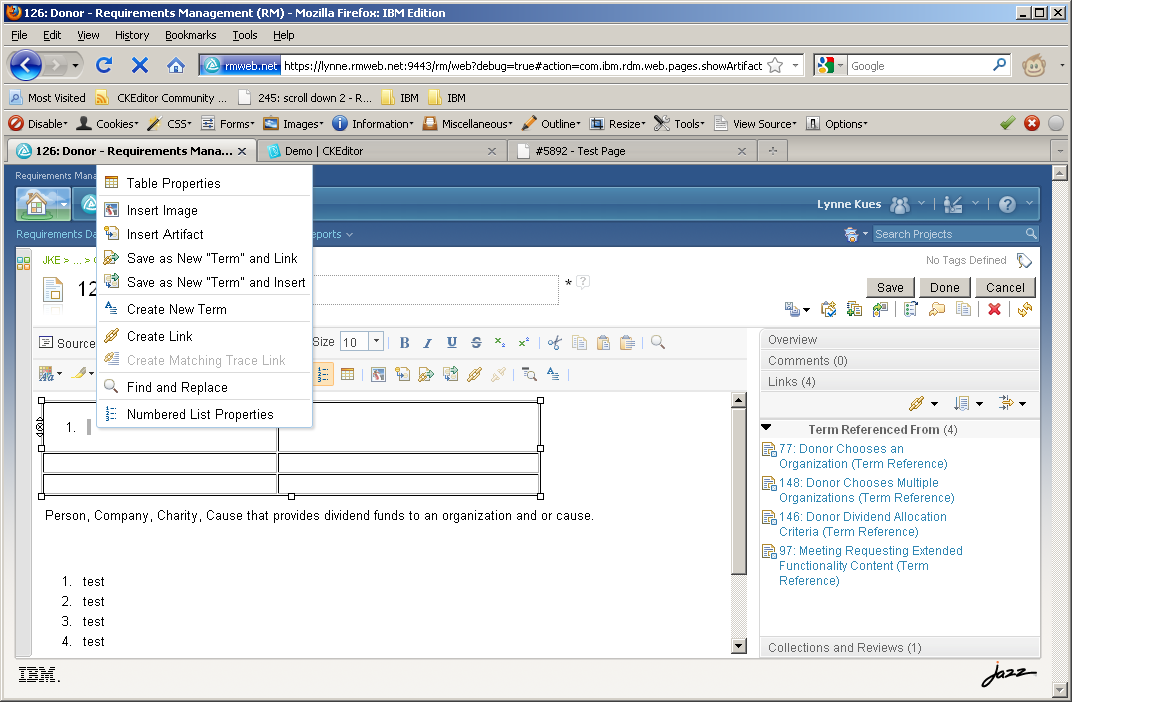
Run the attached example code. Put the cursor in the first cell of the table. Enter some text and then select it. Popup the context menu. Now size the browser window such that the context menu height will exceed the editor content area height (the height of the text area in the editor). Put the cursor in the first cell of the table, select text and popup the context menu.
Notice that the context menu gets clipped even though it can successfully fit within the browser window. See attachment.
This behavior is worse for us since we add items to the context menu. See attachment.
Attachments (6)
Change History (15)
Changed 15 years ago by
| Attachment: | context-menu-ticket.html added |
|---|
Changed 15 years ago by
| Attachment: | context-menu1.png added |
|---|
Changed 15 years ago by
| Attachment: | context-menu2.png added |
|---|
comment:1 Changed 15 years ago by
| Component: | General → UI : Context Menu |
|---|---|
| Status: | new → confirmed |
This is the way the menu positioning calculation happens. Basically, if the editor finds out that there is no visible space at the bottom of the clicking are to show the menu, it shows it above that point, without checking if we have visible space there as well.
comment:2 Changed 15 years ago by
| Version: | 3.4.2 → 3.0.2 |
|---|
I have managed to reproduce it from CKE 3.0.2
comment:3 Changed 15 years ago by
| Cc: | satya_minnekanti@… added |
|---|
Changed 14 years ago by
| Attachment: | 8629.patch added |
|---|
comment:4 Changed 14 years ago by
| Owner: | set to Garry Yao |
|---|---|
| Status: | confirmed → review |
The patch makes the panel layout a bit smarter, to take the maximum amount of available spaces for displaying, in this case, panel lies toward the down-side.
comment:5 Changed 14 years ago by
| Status: | review → review_failed |
|---|
It's not a matter of just using the side with more space available. The problem here is the fact of cutting the menu at the top, which should never happen.
comment:6 Changed 14 years ago by
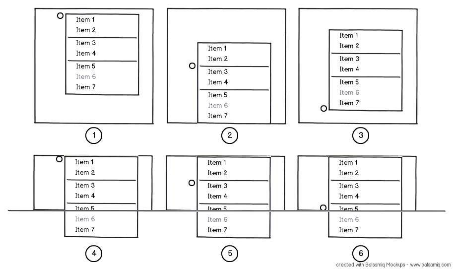
I've attached a mockup that illustrates a few cases. The small circle represents the anchor (clicking point or reference element position (for combos)), while the big rectangle represents the window (viewport).
These are the description of the cases:
- 1 : The panel goes down because there is enough space for it.
- 2 : The panel tries to go down, but there is no space. So it tries to go up, but no space available again. It gets aligned down the window boundaries as we have enough size on the window to should it.
- 3 : The panel tries to go down, but there is no space. So it tries to go up and in fact there is enough space for it.
- 4/5/6 : There is no space in the window to the panel, so it aligns up the window boundary.
So, much probably, this is the calculation:
- If the window is smaller than the panel, aligns it to the top boundary and return.
- If there is space bellow the anchor, show the panel below its position and return.
- If there is space above the anchor, show the panel above its position and return.
- Finally, align the bottom of the panel with the bottom of the window.
The final result is that the window space is optimized to always show as much as possible of the panel, but never cut it at the top if a cut is necessary.
Changed 14 years ago by
| Attachment: | 8629_2.patch added |
|---|
comment:7 follow-up: 8 Changed 14 years ago by
| Status: | review_failed → review |
|---|
Very nice illustration, so there's nothing else to do than turning this idea into code ;)
One note that browsers will impose a minimum viewport width so in many of the cases we'll not have the opportunities to hit case 4,5,6.
comment:8 Changed 14 years ago by
| Milestone: | → CKEditor 3.6.3 |
|---|---|
| Status: | review → review_passed |
Replying to garry.yao:
One note that browsers will impose a minimum viewport width so in many of the cases we'll not have the opportunities to hit case 4,5,6.
4,5 and 6 are not about the width, but the height. In any case, the provided patch works well for those cases also.
The behavior is very pretty nice now, maximizing the usability of the panels. Congrats ;)
comment:9 Changed 14 years ago by
| Resolution: | → fixed |
|---|---|
| Status: | review_passed → closed |
Fixed with [7368].
source code